Overview
Enrolling in the care program takes users 15 to 45 minutes on the phone without counting hold time. Today, enrollment means calling a number sent by email.
This process can't be done independently, and ends up taking a long time from the user and the support team.
Challenge
As the sole designer, my role was to design a new onboarding flow, beginning with an email that redirects users to the onboard experience.
The registration process involved heavy legal requirements, so I researched and collaborated with the legal team to understand:
HIPAA and CMS
Services
Required consents
Health plan coverage.
I wrapped up with a competitive analysis to identify business opportunities and competitors strengths.
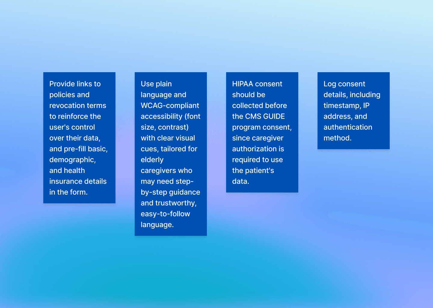
These were the key insights from this research:
Getting to know the customer
After my research, I identified two pain points to keep an eye on for this project.
Pain Point 1: How can we build an interface that conveys trust and security for older users unfamiliar with technology?
Pain Point 2: How can we simplify the complex language of the healthcare and compliance field?
Before creating screens, I mapped a user flow that would guide me through the navigation process, and defined how I could measure success for my usability tests with the following KPIs:
Onboarding Completion Rate (to measure adoption and drop-off)
Average Time to Completion (evaluate speed)
Drop-off Rate by Step (identify specific pain points)

outcome
My first instinct was to shorten the legal text. But research into HIPAA and CMS requirements showed the language was largely non-negotiable.
The real issue wasn't wording, it was sequencing.
Users were hit with all consents in a list upfront, before they understood what they were signing up for and they had to go back and forth to sign each document necessary.
I tested breaking consents into contextual moments (showing the HIPAA disclosure right when we requested medical history) instead of front-loading everything.
Early prototypes still felt heavy, so I added progressive disclosure: a summary line with an expandable 'read full terms' option.

RESULTS
The final flow split legal consent into three contextual checkpoints instead of one dense list of documents to be signed, and without going back and forth to sign them. The new prototypes performed much better, achieving 18% time to complete and 30% less clicks necessary to sign up compared to the initial design.
Enrollment time dropped 38% compared to the phone-based process. What used to be a long call now happens at the user's own pace.
Instead of the support team walking every new patient through the same steps, they can focus on the harder cases: eligibility questions, edge cases, people who actually need a human on the line.


Reflection
If I could redo this, I'd push earlier for user testing on the legal comprehension itself, not just the flow.
I assumed contextual placement would solve comprehension, but we never directly tested whether users understood what they'd agreed to, only whether they completed the flow.
Reducing time for Healthcare Enrollment by 38%
An onboarding experience designed for elderly users to complete registration in a medical care assistance program.
Role
Product Designer
Industry
Health Care
status
Live
Year
2026

Overview
Enrolling in the care program takes users 15 to 45 minutes on the phone without counting hold time. Today, enrollment means calling a number sent by email.
This process can't be done independently, and ends up taking a long time from the user and the support team.
Challenge
As the sole designer, my role was to design a new onboarding flow, beginning with an email that redirects users to the onboard experience.
The registration process involved heavy legal requirements, so I researched and collaborated with the legal team to understand:
HIPAA and CMS
Services
Required consents
Health plan coverage.
I wrapped up with a competitive analysis to identify business opportunities and competitors strengths.
These were the key insights from this research:
Getting to know the customer
After my research, I identified two pain points to keep an eye on for this project.
Pain Point 1: How can we build an interface that conveys trust and security for older users unfamiliar with technology?
Pain Point 2: How can we simplify the complex language of the healthcare and compliance field?
Before creating screens, I mapped a user flow that would guide me through the navigation process, and defined how I could measure success for my usability tests with the following KPIs:
Onboarding Completion Rate (to measure adoption and drop-off)
Average Time to Completion (evaluate speed)
Drop-off Rate by Step (identify specific pain points)
outcome
My first instinct was to shorten the legal text. But research into HIPAA and CMS requirements showed the language was largely non-negotiable.
The real issue wasn't wording, it was sequencing.
Users were hit with all consents in a list upfront, before they understood what they were signing up for and they had to go back and forth to sign each document necessary.
I tested breaking consents into contextual moments (showing the HIPAA disclosure right when we requested medical history) instead of front-loading everything.
Early prototypes still felt heavy, so I added progressive disclosure: a summary line with an expandable 'read full terms' option.
RESULTS
The final flow split legal consent into three contextual checkpoints instead of one dense list of documents to be signed, and without going back and forth to sign them. The new prototypes performed much better, achieving 18% time to complete and 30% less clicks necessary to sign up compared to the initial design.
Enrollment time dropped 38% compared to the phone-based process. What used to be a long call now happens at the user's own pace.
Instead of the support team walking every new patient through the same steps, they can focus on the harder cases: eligibility questions, edge cases, people who actually need a human on the line.
Reflection
If I could redo this, I'd push earlier for user testing on the legal comprehension itself, not just the flow.
I assumed contextual placement would solve comprehension, but we never directly tested whether users understood what they'd agreed to, only whether they completed the flow.